Vision - Calendar

Component Palette Icon:
Description
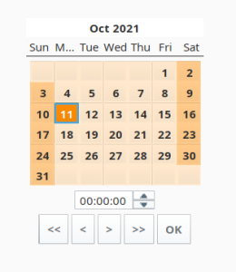
Displays a calendar and time input directly embedded in your window. Most commonly used by including one of the two date properties (immediate or latched) from the calendar in a dynamic SQL Query Binding in Vision.
Properties
| Property | Description | Property Type | Scripting | Category |
|---|---|---|---|---|
| Background Color | The background color of the component. Can be chosen from color wheel, chosen from color palette, or entered as RGB or HSL value. See Color Selector. | Color | .background | Appearance |
| Border | The border surrounding this component. Options are No border, Etched (Lowered), Etched (Raised), Bevel (Lowered), Bevel (Raised), Bevel (Double), and Field Border. Note: The border is unaffected by rotation. Changed in 8.1.21 As of 8.1.21, the "Button Border" and "Other Border" options are removed. | Border | .border | Common |
| Cursor | The mouse cursor to use when hovering over this component. Options are: Default, Crosshair, Text, Wait, Hand, Move, SW Resize, or SE Resize. | int | .cursorCode | Common |
| Date (immediate) | The date as it is selected right now. | Date | .date | Data |
| Date (latched) | The date the last time "OK" was pressed. | Date | .latchedDate | Data |
| Enabled | If disabled, a component cannot be used. | boolean | .componentEnabled | Common |
| Font | Font of text on this component. | Font | .font | Appearance |
| Foreground Color | The foreground color of the component. See Color Selector. | Color | .foreground | Appearance |
| Format String | The date formatting pattern used to format the string versions of the dates. | String | .format | Behavior |
| Formatted Date | The date property, as formatted by the format string. | String | .formattedDate | Data |
| Formatted Latched Date | The latched date property, as formatted by the format string. | String | .formattedLatchedDate | Data |
| Mouseover Text | The text that is displayed in the tooltip which pops up on mouseover of this component. | String | .toolTipText | Common |
| Name | The name of this component. | String | .name | Common |
| Opaque | If false, backgrounds are not drawn. If true, backgrounds are drawn. | boolean | .opaque | Common |
| Quality | The data quality code for any Tag bindings on this component. | QualityCode | .quality | Data |
| Selected Border | The border for the selected day indicator. | Border | .selectedBorder | Appearance |
| Show OK Button | Turn this off if you don't want to show the OK button. The latched date and the immediate date will be equivalent. | boolean | .showOkButton | Behavior |
| Show Time | Turn this off if you don't want to show the time panel. | boolean | .showTime | Behavior |
| Styles | Contains the component's styles. | Dataset | .styles | Appearance |
| Time Display Format | The format for displaying time in the panel. | int | .timeDisplayFormat | Behavior |
| Time Style | Select how this calendar should treat the time portion of the date. | int | .timeStyle | Behavior |
| Title Background | The background of the title bar. See Color Selector. | Color | .titleBackground | Appearance |
| Today Background | Background color for the today indicator. See Color Selector. | Color | .todayBackground | Appearance |
| Today Foreground | Foreground color for the today indicator. See Color Selector. | Color | .todayForeground | Appearance |
| Visible | If disabled, the component will be hidden. | boolean | .visible | Common |
| Weekend Background | Background color for the weekend indicators. See Color Selector. | Color | .weekendBackground | Appearance |
| Weekend Foreground | Foreground color for the weekend indicators. See Color Selector. | Color | .weekendForeground | Appearance |
Deprecated Properties
| Property | Description | Property Type | Scripting | Category |
|---|---|---|---|---|
| Data Quality | The data quality code for any Tag bindings on this component. | int | .dataQuality | Deprecated |
Scripting
Component Functions
This component does not have component functions associated with it.
Extension Functions
This component does not have extension functions associated with it.
Event Handlers
Event handlers allow you to run a script based off specific triggers. See the full list of available event handlers on the Component Events page
Customizers��
Examples
| Property Name | Value |
|---|---|
| Background Color | 255,232,204 |
| Today Background | 255,140,0 |
| Weekend Background | 255,202,138 |