Report Component - Bar Chart

Component Palette Icon:
Description
A Bar Chart is used to display data in a chart using bars. A Bar Chart typically contains a single string column that gets used as the Domain with as many other columns representing the Range axis values. The order of the dataset matters, and the string values used for the domain should be in the first column of the dataset.
Properties
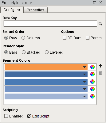
Configure Tab
| Property/Symbol | Description |
|---|---|
| Data Key | Unique identifier or placeholder to the data source that will populate the chart. |
| Extract Order | The order in which the data should be extracted from the data key. Two options are available: Row: Data is extracted by row. Use this when columns in the data key define the series of data. Column: data is extracted by column. Use this when rows in the data key define the series of data; each column is a new value for the same series. This is sometimes referred to as data 'turned on its side' |
| Options | 3D: Columns and bars with 3D appearance using angle and depth. Pareto: When enabled, turns the chart into a Pareto chart. Contains both lines and a bar graph where values are in descending order. |
| Render Style | Provides three rendering styles: Bars: Displays data as individual colored bars. Stacked: Displays data as a stacked bar in different colors. Layered: Displays data as a layered bar in different colors. |
| Segment Colors | A unique color in the RGBA color space for each segment (bar). |
Color Wheel  | Tool for creating color combinations for bars. |
Add Segment  | Adds a color / row. |
Remove Segment  | Deletes a color / row. |
| Scripting Enabled | Enables the script for this component to run. |
| Edit Script | Allows the chart to be modified before the report is rendered. |
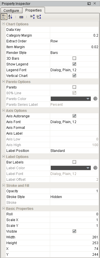
Properties Tab
| Property | Description | Category |
|---|---|---|
| Data Key | Data key of the dataset that drives this bar chart. | Chart Options |
| Category Margin | Spacing between groups of bars on the chart. | Chart Options |
| Extract Order | Determines whether the series are defined by rows or columns in the underlying dataset. | Chart Options |
| Item Margin | Spacing between bars within a group. | Chart Options |
| Render Style | Style for this bar chart. Options are bars (0), stacked (1), or layered (2). | Chart Options |
| 3D Bars | If true, use 3D bars to draw chart. | Chart Options |
| Show Legend | If true, show the chart's legend. | Chart Options |
| Legend Font | Font to use for the chart's legend. | Chart Options |
| Vertical Chart | If true, draw bars vertically. | Chart Options |
| Pareto | If enabled, the chart will act as a pareto chart; ordering the bars descending and adding a percentage line. | Pareto Options |
| 80% Line | If true, draw a line showing where 80% of the total is. | Pareto Options |
| Pareto Color | Color for the Pareto line and 80% line. | Pareto Options |
| Pareto Series Label | Text to use in legend for the Pareto line. | Pareto Options |
| Axis Autorange | If true, set the axis range automatically, otherwise use the Axis Low and Axis High values. | Axis Options |
| Axis Font | Font to use for axis and axis label. | Axis Options |
| AxisFormat | A optional number format string to override the automatic formatting on the y-axis. | Axis Options |
| Axis Label | Text to place on the axis label. May be blank. | Axis Options |
| Axis Low | If autorange is turned of, the low value to use for the axis. | Axis Options |
| Axis High | If autorange is turned off, the high value to use for the axis. | Axis Options |
| Label Position | Orientation of category labels. | Axis Options |
| Bar Labels | If true, add labels to each bar. | Label Options |
| Label Color | Color to use for bar label text. | Label Options |
| Label Font | Font to use for bar labels. | Label Options |
| Label Offset | Space to add between the end of the bar and the label. Negative numbers will put the label onto the bar. | Label Options |
| Opacity | How opaque the fill color is, between 0 and 1. | Stroke and Fill |
| Stroke Style | What style of stroke or border to use: Hidden, Shape Outline, Border, or Double. To learn more about stroke styles, refer to Stroke and Fill Properties. | Stroke and Fill |
| Stroke | Details for the chosen stroke. Each Stroke has its own properties depending on the Stroke Style chosen. | Stroke and Fill |
| Roll | Number of degrees this shape is rotated clockwise. | Basic Properties |
| Scale X | Amount to scale the width of this shape. 1 is scale to 100%. | Basic Properties |
| Scale Y | Amount to scale the height of this shape. 1 is scale to 100%. | Basic Properties |
| Visible | If true, the shape will be visible. | Basic Properties |
| Width | Width of this shape in pixels. | Basic Properties |
| Height | Height of this shape in pixels. | Basic Properties |
| X | Horizontal distance in pixels between the left edge of this shape and the left edge of the page. | Basic Properties |
| Y | Vertical distance in pixels between the top edge of this shape and the top edge of the page. | Basic Properties |
Example

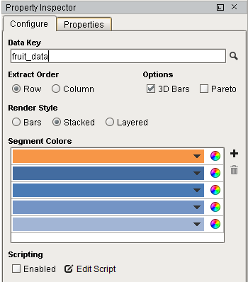
| Property | Value |
|---|---|
| 3D Bars | True |
Bar Chart Sample CSV Data
Fruit, Quantity, AvgWeight
Apples, 150, 183
Bananas, 56, 151
Mango, 190, 300
Oranges, 33, 77