Vision - Multi-State Button

Component Palette Icon:
This component consists of two or more buttons arranged in a column, row, or grid. Each button corresponds to an integer-valued state and is displayed with the correct style based on the component's Indicator Value. When a button is pressed then released, its value is written to the Control Value.
Properties
| Property | Description | Property Type | Scripting | Category |
|---|---|---|---|---|
| Confirm Text | The message to display in a confirmation box if Confirm? is true. Default is "Are you sure?" | string | .confirmText | Behavior |
| Confirm? | If true, a confirmation box will be shown. | boolean | .confirm | Behavior |
| Control Value | Value that controls the state. Typically, this is bound to the same location as the Indicator Value. | int | .controlValue | Data |
| Cursor | The mouse cursor to use when hovering over this component. Options are: Default, Crosshair, Text, Wait, Hand, Move, SW Resize, or SE Resize. | int | .cursorCode | Common |
| Display Style | The display style (rows or columns) for this N-state button. | int | .displayStyle | Appearance |
| Enabled | If disabled, a component cannot be used. | boolean | .componentEnabled | Common |
| Focusable | If false, users cannot interact with the component using the keyboard. | boolean | .focusableEnabled | Behavior |
| Font | Font of text on this component. | Font | .font | Appearance |
| Grid Cols | The number of columns if the Display Style is set to "Grid" mode. | int | .gridCols | Appearance |
| Grid Rows | The number of rows if the Display Style is set to "Grid" mode. | int | .gridRows | Appearance |
| Horizontal Gap | The horizontal spacing between buttons. | int | .hGap | Appearance |
| Indicator Value | Value that indicates the current state. Typically, this is bound to the same location as the Control Value. | int | .indicatorValue | Data |
| Mouseover Text | The text that is displayed in the tooltip which pops up on mouseover of this component. | String | .toolTipText | Common |
| Name | The name of this component. | String | .name | Common |
| Quality | The data quality code for any tag bindings on this component. | QualityCode | .quality | Data |
| Rollover | If true, the button may indicate that the mouse is hovering over it. | boolean | .rolloverEnabled | Behavior |
| States | A Dataset that stores the information for the different states. | Dataset | .states | Behavior |
| Vertical Gap | The vertical spacing between buttons. | int | .vGap | Appearance |
| Visible | If disabled, the component will be hidden. | boolean | .visible | Common |
Deprecated Properties
| Property | Description | Property Type | Scripting | Category |
|---|---|---|---|---|
| Data Quality | The data quality code for any tag bindings on this component. | int | .dataQuality | Deprecated |
Scripting
Component Functions
This component does not have component functions associated with it.
Extension Functions
This component does not have extension functions associated with it.
Event Handlers
Event handlers allow you to run a script based off specific triggers. See the full list of available event handlers on the Component Events page
Customizers
The Multi-State Button Customizer consists of four panels:
- Preview: Displays a preview image of the component
- States: Displays a list of possible states. Each state corresponds to one button. You may add, remove, and re-order states.
- Selected Style: Displays configurable style properties for the selected button. The button will use this style when its state is active.
- Unselected Style: Displays configurable style properties for the selected button. The button will use this style when its state is inactive.
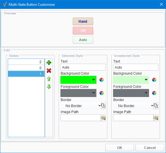
Multi-State Button Customizer Property Descriptions
| Property | Description |
|---|---|
| Text | Text displayed on the button. |
| Background Color | Color of the button |
| Foreground Color | Color of the text |
| Border | Type of border around the button |
| Image Path | Relative path name for an image on the button |
Example

| Property Name | Value |
|---|---|
| Display Style | Grid |
| Styles | 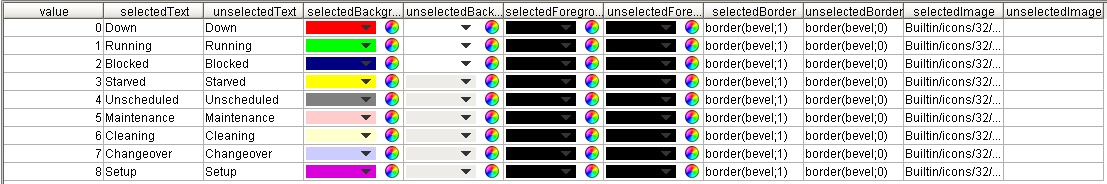 |