Vision - Power Table
Component Palette Icon:
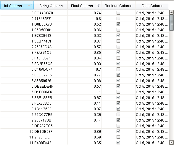
Description
The power table is a more customizable version of the table component. The power table contains advanced features such as drag-and-drop rows, multi-column sorting, column filtering, and cell-spanning.
Power Table Features
- Multi-column sorting: To sort multiple columns, select the header of the first column, hold down the Control key, then select the header of the next column. Click on the header again to reverse the sort order, and click a third time to remove sorting on the column.
- Column filtering: Columns can be temporarily hidden from view using column filtering. Right-click on the header of the table, and uncheck columns that you would like to hide. You can disable this feature by disabling the Column Chooser Menu property on the table.
- Column reordering: You can switch the locations of columns on the table using column reordering. Drag the header of the column that you would like to move to a new location on the table. You can disable this feature by disabling the Columns Re-Orderable property on the table.
- Cell spanning: A cell can be spanned across multiple columns and rows. Keep in mind that you must explicitly define the locations of cells that must be spanned. This means that if you would like to use cell spanning, any other table features that change how the table is displayed will be disabled automatically (such as sorting, column filtering and column reordering). Click on the Cell Span Data dataset to configure spanning. Within the dataset, add a row for each new span. The "row" column controls the row in the table where the span will start. The "column" column controls the column where the span will start. The "width" column controls how many columns the span will cover. The "height" column controls how many rows the span will cover. Adding a row where "row=4, column=1, width=2, height=3" results in a span starting on the fifth row of the table and the second column (using 0-based indexing). The span will cover the second and third columns in the row and will also cover two rows below the fifth row, as shown below.
- Drag and Drop: This feature allows you to drag rows from one power table to another power table. In order to perform drag and drop, you must implement the onRowsDropped() extension function on the destination table. This is so that you can adapt the data from one table to the other within the function. You must also enable the Row Dragging Enabled property on both tables.
- Row Copying: This feature allows you to select rows and copy them to the clipboard using the standard keyboard shortcut Ctrl + C. These can then be pasted anywhere, even outside of Ignition.
caution
Even if a column is set to be editable, the edit must be handled by the onCellEdited extension function. If that extension function is not enabled and properly set up, the cell will revert back to its previous value.
Properties
| Property | Description | Property Type | Scripting | Category |
|---|---|---|---|---|
| Auto Row Height | Enables automatic resizing of row height. | boolean | .rowResizeEnabled | Behavior |
| Auto-Resize Mode | Determines how the table resizes the columns. | int | .autoResizeMode | Behavior |
| Background Color | The background color of the component. Can be chosen from color wheel, chosen from color palette, or entered as RGB or HSL value. See Color Selector. | Color | .background | Appearance |
| Cell Span Data | This dataset holds information about how cells in the table span multiple rows and/or columns. Incompatible with column sorting and re-ordering. | Dataset | .cellSpanData | Data |
| Column Attributes Data | The dataset describing the column attributes. Note: The data in this property doesn't get initialized until the customizer is opened and the OK button is pressed. | Dataset | .columnAttributesData | Appearance |
| Column Chooser Menu | Enables a right-click popup menu on the column headers with options to show and hide columns. For full menu options, see Column Chooser Menu Options. | boolean | .headerColumnChooserMenus | Behavior |
| Column Resize Menu | Enables a right-click popup menu on the column headers with resizing options. | boolean | .headerResizeMenus | Behavior |
| Column Selection Allowed | This flag is used in conjunction with the Row Selection Allowed flag to determine whether not whole-rows, whole-columns, or both (single-cells) are selectable. | boolean | .columnSelectionAllowed | Behavior |
| Column Sizing | Represents column sizing and position to preserve user-selected ordering. | String | .defaultColumnView | Appearance |
| Columns Re-Orderable | Enables the re-ordering of columns by dragging the column headers. | boolean | .columnReorderingAllowed | Behavior |
| Columns Resizable | Enables the resizing of columns by dragging the margins of the column headers. | boolean | .columnResizingAllowed | Behavior |
| Cursor | The mouse cursor to use when hovering over this component. Options are: Default, Crosshair, Text, Wait, Hand, Move, SW Resize, or SE Resize. | int | .cursorCode | Common |
| Data | The data for this table. | Dataset | .data | Data |
| Edit Click Count | The number of clicks required to start editing a cell. | int | .clickCountToStart | Behavior |
| Enabled | If disabled, a component cannot be used. | boolean | .componentEnabled | Common |
| Font | Font of text on this component. | Font | .font | Appearance |
| Foreground Color | The foreground color of the component. See Color Selector. | Color | .foreground | Appearance |
| Grid Line Color | The color used to draw grid lines. See Color Selector. | Color | .gridColor | Appearance |
| Header Font | Font of the table's header text. | Font | .headerFont | Appearance |
| Header Visible | Allows for hiding of the table's header. | boolean | .headerVisible | Appearance |
| Inter Cell Spacing | The space (in pixels) between the cells. | Dimension | .interCellSpacing | Appearance |
| Name | The name of this component. | String | .name | Common |
| Non-Contiguous Selection | Enables totally non-contiguous selection in the table. | boolean | .nonContiguousCellSelection | Behavior |
| Properties Loading | The number of properties currently being loaded. (Read only. Usable in bindings and scripting.) | int | .propertiesLoading | Uncategorized |
| Quality | The data quality code for any Tag bindings on this component. | QualityCode | .quality | Data |
| Row Dragging Enabled | Enables drag-and-drop re-ordering for table rows. Implementing the 'onRowsDropped' extension function is also required to have functional drag-and-drop. | boolean | .rowDragEnabled | Behavior |
| Row Height | If row resizing is disabled, this will set the height of all rows. | int | .rowHeight | Behavior |
| Row Selection Allowed | This flag is used in conjunction with the Column Selection Allowed flag to determine whether not whole-rows, whole-columns, or both (single-cells) are selectable. | boolean | .rowSelectionAllowed | Behavior |
| Selected Column | The index of the first selected column, or -1 if none. | int | .selectedColumn | Data |
| Selected Row | The index of the first selected row, or -1 if none. | int | .selectedRow | Data |
| Selection Background | The default background color of selected cells. See Color Selector. | Color | .selectionBackground | Appearance |
| Selection Foreground | The default foreground color of selected cells. See Color Selector. | Color | .selectionForeground | Appearance |
| Selection Mode | This mode determines if only one row/cell/column can be selected at once, or single or multiple intervals. | int | .selectionMode | Behavior |
| Show Horizontal Grid Lines? | Shows horizontal grid lines. | boolean | .showHorizontalLines | Appearance |
| Show Vertical Grid Lines? | Shows vertical grid lines. | boolean | .showVerticalLines | Appearance |
| Sorting Enabled | Enables automatic multi-column sorting by clicking and CTRL-clicking on the table header. | boolean | .sortingEnabled | Behavior |
| TestData | Toggle this property to fill in the table's data with random data. | boolean | .test | Misc |
| View Dataset | A read-only copy of the data as it appears on screen in the table. The purpose of this property is to preserve the column ordering, column visibility, and applied sorting order. Other attributes, such as formatting, will not be preserved in this dataset. | Dataset | .viewDataset | Data |
| Visible | If disabled, the component will be hidden. | boolean | .visible | Common |
Column Chooser Menu Options

| Property | Description |
|---|---|
| Auto Resize This Column | Resizes the selected column as determined by the Auto-Resize Mode property. |
| Auto Resize All Columns | Resizes all columns as determined by the Auto-Resize Mode property. |
| Hide This Column | Hides the selected column. |
| Show All Hidden Columns | Shows all columns that were hidden in the current Client Session. Option is only visible after a column has been hidden. |
| Available Column List | Lists all available table columns with the option to show or hide each column. |
| Reset to Default | Resets the Power Table to the Designer configuration, overriding any Client Session changes. |
| More... | Opens a popup window with the complete column list to select the columns to display. |
Scripting
See the Power Table Scripting Functions page for the full list of scripting functions available for this component.
Event Handlers
Event handlers allow you to run a script based off specific triggers. See the full list of available event handlers on the Component Events page.
Customizers
New in 8.1.14
The Power Table Customizer can be opened by double-clicking on the Power Table in the Designer.
Example
Code Snippet
#Example of an onRowsDropped() extension script for two power tables with identical columns:

def onRowsDropped(self, sourceTable, rows, rowData, dropIndexLocation):
    if self != sourceTable:
        destDataset = self.getData()
        pyRowData = system.dataset.toPyDataSet(rowData)
        # Loop thru all the rows that have been selected and dragged to the
        # destination table.
        for row in pyRowData:
            newRow = []
            for column in row:
                newRow.append(column)
            destDataset = system.dataset.addRow(destDataset, dropIndexLocation, newRow)
        # Adds the rows to the destination table.
        self.setData(destDataset)
        # Optional. Deletes the dragged rows from the source table.
        sourceDataset = system.dataset.deleteRows(sourceTable.getData(), rows)
        sourceTable.setData(sourceDataset)
    else:
        system.gui.messageBox("Dropping on to same table not supported")
        # To drop onto the same table, the new row indices must be calculated
        # for both the dropped and deleted rows, taking changes into account.