Vision - User Management
Component Palette Icon:
Description
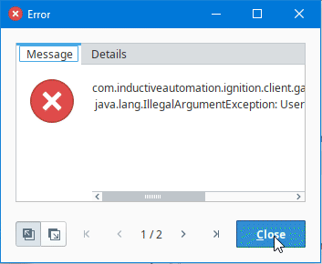
The User Management component provides a built-in way to edit User Source users and roles from a Vision Client. To make changes to the Gateway's system user source from the Designer or Client, the Allow User Admin setting must be enabled. This allows for the administration of the Gateway's system user source from the Designer and Vision Client. Unless this is enabled, the Vision Module's User Management component is prevented from modifying the Gateway system's selected user source and you will see an error at the bottom of the component if it is attempted.
If a User Source has its Schedule Restricted option enabled, modifications made using the Vision User Management component used to be ignored. Schedule modifications are now applied on top of the user's defined schedule to determine their effective schedule when evaluating for Schedule Restricted login.
This component can be run in one of three modes:
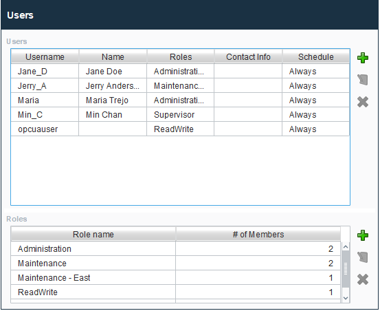
- Manage Users Mode: In this mode, the component manages all of the users contained in the user source. Users and roles may be added, removed, and edited.
- Edit Single Mode: In this mode, the component only edits a single user. Which user is being edited is controlled via the "User Source" and "Username" properties.
- Edit Current Mode: In this mode, the user who is currently logged into the project can edit themselves. Obviously, the ability to assign roles is not available in this mode. This can be useful to allow users to alter their own password, adjust their contact information, and update their schedules.
Be careful to only expose this component to users who should have the privileges to alter other users. Access to this component in Manage Users mode will allow users to edit other users' passwords and roles.
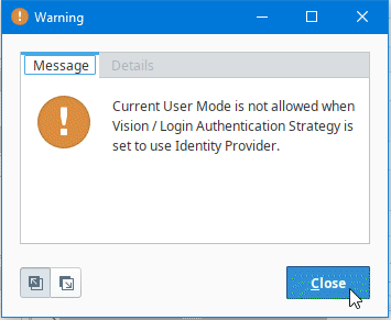
The User Management component cannot be used in Edit Current Mode when the Vision Client is using an Identity Provider to log in. Attempting to use the User Management component in this situation will result in the Vision client throwing an error and a warning:
Properties
| Name | Description | Property Type | Scripting | Category |
|---|---|---|---|---|
| Border | The border surrounding this component. Options are No border, Etched (Lowered), Etched (Raised), Bevel (Lowered), Bevel (Raised), Bevel (Double), and Field Border. Note: The border is unaffected by rotation. Changed in 8.1.21 As of 8.1.21, the "Button Border" and "Other Border" options are removed. | Border | .border | Common |
| Contact Info Editing Enabled | If true, a user's contact info will be editable. | boolean | .allowContactInfoEditing | Behavior |
| Editing Schedule Available Color | Changes the color of the available times in the schedule. See Color Selector. | Color | .schedulePreviewAvailableColor | Appearance |
| Editing Schedule Available Text Color | Changes the text color of events on the schedule preview. See Color Selector. | Color | .eventForeground | Appearance |
| Enabled | If disabled, a component cannot be used. | boolean | .componentEnabled | Common |
| Font | Font of the text on this component. | Font | .font | Appearance |
| Mode | Affects what mode the user management component runs in. Manage Users: Allows edits to all Users and Roles in a single source determined by the User Source property. Default. intValue = 0 Edit Current: - Allows edits to the currently logged in user details intValue = 1 Edit Single: Allows edits to a specific user determined by the User Source and Username properties.intValue = 2 | int | .mode | Behavior |
| Name | The name of this component. | String | .name | Common |
| Quality | The data quality code for any Tag bindings on this component. | QualityCode | .quality | Data |
| Role Assigning Enabled | If true, a user's roles will be editable. | boolean | .allowRoleAssigning | Behavior |
| Role Management Enabled | If true, role management is available. | boolean | .allowRoleManagement | Behavior |
| Row Height | Alter the size of the rows in the component's tables. | int | .rowHeight | Appearance |
| Schedule Adjustments Enabled | If true, a user's schedule adjustments will be editable. | boolean | .allowScheduleModifications | Behavior |
| Show Contact Info Column | Controls whether the user table shows the contact info column or not. | boolean | .columnContactInfo | Appearance |
| Show Name Column | Controls whether the user table shows the name column or not. | boolean | .columnName | Appearance |
| Show Roles Column | Controls whether the user table shows the roles column or not. | boolean | .columnRoles | Appearance |
| Show Schedule Column | Controls whether the user table shows the schedule column or not. | boolean | .columnSchedule | Appearance |
| Show Username Column | Controls whether the user table shows the username column or not. | boolean | .columnUsername | Appearance |
| Styles | Contains the component's styles. | Dataset | .styles | Appearance |
| Table Color | Changes the background color of the tables, User Roles and Role Member lists. Note: When a row is selected it will revert to highlighted. | Color | .tableBackground | Appearance |
| Table Header Color | Changes the background color of the table headers. See Color Selector. | Color | .tableHeaderBackground | Appearance |
| Table Header Text Color | Changes the text color of the table headers. See Color Selector. | Color | .tableHeaderTextColor | Appearance |
| Table Text Color | Changes the text color of the tables. Note: When a row is selected, it will revert to black. See Color Selector. | Color | .tableForeground | Appearance |
| Touchscreen Mode | Controls when this input component responds if touchscreen mode is enabled. | int | .touchscreenMode | Behavior |
| User Source | The user source to manage users in. If blank, uses the project's default user source. | String | .userProfile | Behavior |
| Username | The name of the user being edited. Read-only except when mode is Edit Single, in which case it defines the user to be edited. | String | .username | Behavior |
| Username Editing Enabled | If true, usernames will be editable. | boolean | .allowUsernameEditing | Behavior |
| Visible | If disabled, the component will be hidden. | boolean | .visible | Common |
| Window Color | Changes the window background color. See Color Selector. | Color | .windowBackground | Appearance |
| Window Header Color | Changes the window header background color. See Color Selector. | Color | .windowHeaderBackground | Appearance |
| Window Header Save Button Background Color | Changes the window header save button background color. See Color Selector. | Color | .windowHeaderSaveButtonBackground | Appearance |
| Window Header Save Button Text Color | Changes the window header save button text color. See Color Selector. | Color | .windowHeaderSaveButtonForeground | Appearance |
| Window Header Text Color | Changes the window header text color. See Color Selector. | Color | .windowHeaderForeground | Appearance |
| Window Text Color | Changes the text color of the window. See Color Selector. | Color | .windowForeground | Appearance |
Scripting
See the Vision - User Management Scripting Functions page for the full list of scripting functions available for this component.
Event Handlers
Event handlers allow you to run a script based off specific triggers. See the full list of available event handlers on the Component Events page.