Multi-State Indicator
Component Palette Icon
This component is a specialized label used to display a discrete state. The state must be represented by an integer, but the values and number of different states is customizable. Use the component's styles customizer to configure the different states.
Properties
| Name | Description | Property Type | Scripting | Category |
|---|---|---|---|---|
| Antialias | Draw with antialias on? Makes text smoother. | boolean | .antialias | Appearance |
| Background Color | The background color of the component. | Color | .background | Appearance |
| Border | The border surrounding this component. NOTE that the border is unaffected by rotation. | Border | .border | Common |
| Cursor | The mouse cursor to use when hovering over this component. | int | .cursorCode | Common |
| Data Quality | The data quality code for any tag bindings on this component. | int | .dataQuality | Data |
| Disabled Image Path | The relative path of the image to be displayed when this component is not enabled. | String | .disabledPath | Appearance |
| Enabled | If disabled, a component cannot be used. | boolean | .componentEnabled | Common |
| Font | Font of text on this component. | Font | .font | Appearance |
| Foreground Color | The foreground color of the component. | Color | .foreground | Appearance |
| Horizontal Alignment | Determines the alignment of the label's contents along the X axis. | int | .horizontalAlignment | Layout |
| Horizontal Text Position | Determines the horizontal position of the label's text, relative to its image. | int | .horizontalTextPosition | Layout |
| Icon-Text Spacing | The space (in pixels) between the icon (if any) and the text (if any). | int | .iconTextGap | Appearance |
| Image Path | The relative path of the image. | String | .path | Appearance |
| Mouseover Text | The text that is displayed in the tooltip which pops up on mouseover of this component. | String | .toolTipText | Common |
| Name | The name of this component. | String | .name | Common |
| State | The current state of the component. | int | .state | Data |
| Styles | Contains the component's styles. | Dataset | .styles | Appearance |
| Text | Text of this Label. | String | .text | Data |
| Vertical Alignment | Determines the alignment of the label's contents along the Y axis. | int | .verticalAlignment | Layout |
| Vertical Text Position | Determines the vertical position of the label's text, relative to its image. | int | .verticalTextPosition | Layout |
| Visible | If disabled, the component will be hidden. | boolean | .visible | Common |
Scripting
Scripting Functions
This component does not have scripting functions associated with it.
Extension Functions
This component does not have extension functions associated with it.
Event Handlers
Event handlers allow you to run a script based off specific triggers. See the full list of available event handlers on the Component Events page
Customizers
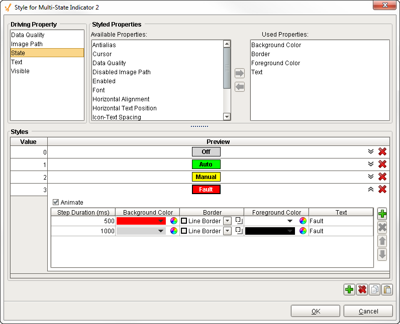
The Multi-State Indicator component does not have a special customizer, however, it relies on the Style Customizer. When you open the Style Customizer, you'll notice that it has the State driving property selected, and several visual properties defined such as Background Color, Border, Foreground Color, and Text. If you don't like the predefined properties, you can change them, as well as add or remove any styled properties.
The Style Customizer for the Multi-State Indicator works by configuring a set of visual properties that change based on a different state. The State is represented by an integer, but the values and number of different states are customizable.
Style Customizer for the Multi-State Indicator - Property Description
| Property | Description |
|---|---|
| Driving Property | Property that drives the style of the component. |
| Styled Properties | There are two categories of properties: Available Properties and Used Properties. |
| Available Properties | Styled properties that have not been used. |
| Used Properties | Styled properties that have been used. |
| Styles | Styles section for the defining states and styles. |
| Values | Driving property represented by an integer. |
| Preview | View the label after the visual styles are configured. Expand each value to configure, or change any of the styles. There is an Animate checkbox that you can check to enable the label to blink. |
Examples
| Property Name | Value |
|---|---|
| Styles | As defined by the style customizer. |