Tab Strip
Component Palette Icon
In general, a Tab Strip is just a single-selection multiple choice component. In practice it is used anywhere that a user needs to be able to select between multiple windows or to select between containers to display. It is most commonly used in a docked window to provide automatic window navigation. To support this typical use-case, the tab strip has two navigation modes:
- Swap to Window - (default) The Tab Strip will automatically call system.nav.swapTo() with the name of the selected tab. This facilitates very easy navigation for most common projects.
- Disabled - The Tab Strip doesn't do anything when the tab selection changes. Users can implement their own via property bindings or by responding to the propertyChange scripting event.
The Tab Strips visual style is highly customizable. There are different rendering styles, and things such as fonts, colors, line thicknesses, hover colors, and gradients are customizable within each rendering style. Use the Tab Strip's customizer to come up with a style that suits your project, as well as to manage the tabs that are present. The tabs and their styles are all stored in a dataset property (called Tab Data), so they can be modified at runtime as well.
Properties
| Name | Description | Property Type | Scripting | Category |
|---|---|---|---|---|
| Antialias | Draw with antialias on? Makes text smoother. | boolean | .antialias | Appearance |
| Background Color | The background color of the component. | Color | .background | Appearance |
| Border | The border surrounding this component. NOTE that the border is unaffected by rotation. | Border | .border | Common |
| Cursor | The mouse cursor to use when hovering over this component. | int | .cursorCode | Common |
| Data Quality | The data quality code for any tag bindings on this component. | int | .dataQuality | Data |
| Enabled | If disabled, a component cannot be used. | boolean | .componentEnabled | Common |
| Intertab Space | The amount of space between each tab. | int | .interTabSpace | Appearance |
| Name | The name of this component. | String | .name | Common |
| Navigation Mode | Navigation mode. Disabled does nothing when a tab is pressed. Swap to window swaps to the window whose name corresponds to the name of the selected tab, provided that window exists. | int | .navigationMode | Behavior |
| Orientation | Orientation of the tab strip. | int | .orientation | Appearance |
| Renderer | The renderer to use when rendering tabs. | int | .renderer | Appearance |
| Rounding Radius | Rounding radius for the tab corners. | int | .roundingRadius | Appearance |
| Selected Tab | Name of the selected tab. This is also the name of the window that, if it exists, will be swapped to when this tab is pressed. | String | .selectedTab | Appearance |
| Separator Color | Color of the line drawn across the bottom and around each tab. | Color | .separatorColor | Appearance |
| Separator Thickness | Thickness of the line drawn across the bottom and around each tab. | float | .separatorThickness | Appearance |
| Size Mode | The sizing mode tabs use when deciding their size. Automatic means every tab is the same fixed size. Individual lets each tab decide its own size based on the size of its text. | int | .sizeMode | Appearance |
| Styles | Contains the component's styles. | Dataset | .styles | Appearance |
| Tab Data | Tab Data. | Dataset | .tabData | Data |
| Text Padding | Padding on each side of the text inside a tab. | int | .textPadding | Appearance |
| Visible | If disabled, the component will be hidden. | boolean | .visible | Common |
Scripting
Scripting Functions
This component does not have scripting functions associated with it.
Event Handlers
Event handlers allow you to run a script based off specific triggers. See the full list of available event handlers on the Component Events page
Customizers
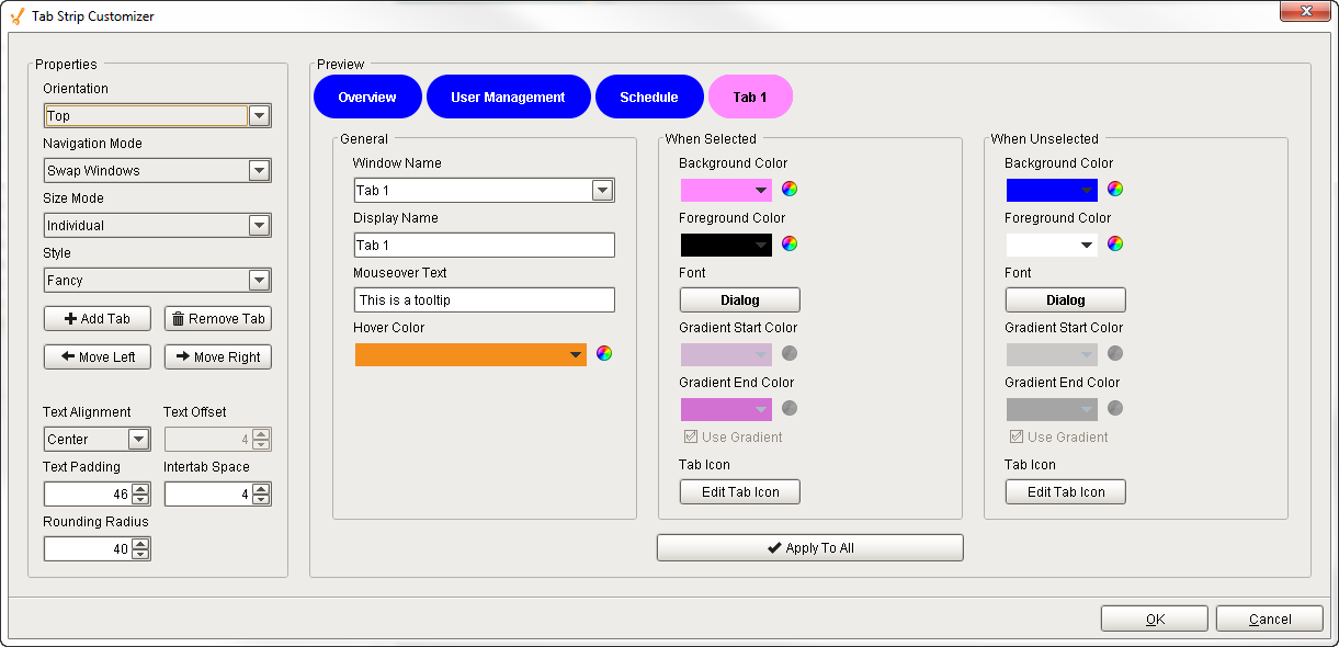
The Tab Strip Customizer has it's own set of properties that you can set and modify which dictate how the Tab Strip component looks and behaves whether or not it is used for window navigation. The tabs and the styles are stored in the Tab Data dataset property.
When customizing the Tab Strip, keep in mind how you are using the component when setting your properties. Some Tab Strip properties may behave a little differently based on style, tab orientation, or text alignment. It's a good idea to use the preview window to verify the style you configured is the style you want.
| Properties | Description |
|---|---|
| Orientation | Orientation of the Tab Strip on a window: Top, Left, Bottom and Right. For example, use the Top orientation to place the Tab Strip component at the top of your window. |
| Navigation Mode | Two Navigation modes:
|
| Size Mode | Two Size modes:
|
| Style | Three style options to change the appearance of the individual tabs: Simple, Fancy, and Folder. |
| Add Tab | Adds a new tab next to the selected tab. |
| Remove Tab | Removes a selected tab. |
| Move Up / Move Down | Depends on the current Orientation selection. Moves the selected tab Up or Down in the tab strip when using the Left or Right orientation. |
| Move Left / Move Right | Depends on the current Orientation selection. Moves the selected tab either Left or Right in the tab strip when using the Top / Bottom orientation. |
| Text Alignment | Inserts text in the Center, Left, or Right inside a tab. |
| Text Offset | Specifies how many pixels to move text to the left or right within a tab. |
| Text Padding | Specifies the number of pixels around the text in the tab. |
| Intertab Space | Specifies the number of pixels between tabs. |
| Rounding Radius | Specifies the number of pixels to round the corners of the tab depending on the tab orientation. |
General Section
| Properties | Description |
|---|---|
| Window Name | Pathname of the window location |
| Display name | The name to display on the tab. |
| Mouseover Text | The text to display in the tooltip which pops up when mousing over a tab. |
| Hover Color | The color to display in the tootip which pops up when mousing over a tab. |
When Selected/When Unselected
| Properties | Description |
|---|---|
| Background Color | The background color of the tab. |
| Foreground Color | The foreground color is the color of the text. |
| Font | Select the font type, font size, and style. |
| Gradient Start Color | Select a start color to begin the gradient. Gradients are not valid for the Fancy style, and are shown as being grayed out. Select Simple or Folder style to use the gradient feature. |
| Gradient End Color | Select an end color to end the gradient. Gradients are not valid for the Fancy style, and are shown as being grayed out. Select Simple or Folder style to use the gradient feature. |
| Use Gradient | Select Use Gradient checkboxes to use gradient features. Uncheck the Use Gradient checkboxes to disable the gradient feature. |
| Tab Icon | Select an image from the Image Browser to insert on a tab. |
| Apply to All | The button applies all of the currently shown settings (except Window Name and Display Name) to all of the tabs. Note: this does not save your changes. |
Example
Horizontal Tabs
| Properties | Description |
|---|---|
| Style | Fancy |
| Orientation | Top |
| Tab Data | Dataset customized with the Tab Strip Customizer. Notice how the Gradient features are grayed out with the Fancy style. |