Multi-State Button

Component Palette Icon
This button is really a series of two or more buttons, arranged in a column, row, or grid. Each button represents an integer-valued state. Each state defines two styles for a button: the selected style, and the unselected style. Each button is automatically displayed with the correct style based on the current state (the value of Indicator Value). When a button is pressed then released, its state's value is written to the Control Value.
To configure a Multi-State Button, simply drag a Tag that represents your state onto the Multi-State Button. This will bind both the Control Value and Indicator Value to that Tag. Now open up the Multi-State Button customizer, and define your states: their order, values and styles. Lastly choose if you want the buttons to be a column, row, or grid by setting the Display Style property.
Properties
| Name | Description | Property Type | Scripting | Category |
|---|---|---|---|---|
| Antialias | Draw with antialias on? Makes text smoother. | boolean | .antialias | Appearance |
| Background 3D? | Controls whether or not the buttons have a gradient-style background color. | boolean | .background3D | Appearance |
| Confirm Text | The message to ask the user if confirmation is turned on. | String | .confirmText | Behavior |
| Confirm? | If true, a confirmation box will be shown. | boolean | .confirm | Behavior |
| Control Value | Bind this to the tag that controls the state. (Typically, this is bound to the same location as Indicator Value) | int | .controlValue | Data |
| Cursor | The mouse cursor to use when hovering over this component. | int | .cursorCode | Common |
| Data Quality | The data quality code for any tag bindings on this component. | int | .dataQuality | Data |
| Display Style | The display style (rows or columns) for this N-state button. | int | .displayStyle | Appearance |
| Enabled | If disabled, a component cannot be used. | boolean | .componentEnabled | Common |
| Focusable | If a button is not focusable, you will not be able to interact with it with the keyboard. This means you can't "tab" over to it. | boolean | .focusableEnabled | Behavior |
| Font | Font of text on this component. | Font | .font | Appearance |
| Grid Cols | The number of columns if the Display Style is set to "Grid" mode. | int | .gridCols | Appearance |
| Grid Rows | The number of rows if the Display Style is set to "Grid" mode. | int | .gridRows | Appearance |
| Horizontal Gap | The horizontal spacing between buttons. | int | .hGap | Appearance |
| Indicator Value | Bind this to the tag that indicates the current state. (Typically, this is bound to the same location as Control Value). | int | .indicatorValue | Data |
| Mouseover Text | The text that is displayed in the tooltip which pops up on mouseover of this component. | String | .toolTipText | Common |
| Name | The name of this component. | String | .name | Common |
| Rollover | If true, the button may indicate that the mouse is hovering over it. | boolean | .rolloverEnabled | Behavior |
| States | A Dataset that stores the information for the different states. | Dataset | .states | Behavior |
| Vertical Gap | The vertical spacing between buttons. | int | .vGap | Appearance |
| Visible | If disabled, the component will be hidden. | boolean | .visible | Common |
Scripting
Scripting Functions
This component does not have scripting functions associated with it.
Extension Functions
This component does not have extension functions associated with it.
Event Handlers
Event handlers allow you to run a script based off specific triggers. See the full list of available event handlers on the Component Events page
Customizers
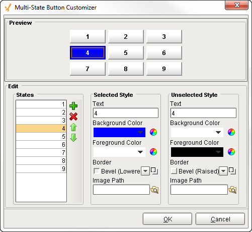
The Multi-State Button has its own Customizer. Here, you can define your states, change the order, values, and styles. You can organize your buttons to be a column, row, or grid by setting the Display Style property in the Property Editor. You'll notice that the Multi-State Button Customizer already has some preset states and pre-defined styles to help you get started.
The Multi-State Button works by defining a set of visual styles that change based on a single State. When one of the buttons is pressed, its state value is written to the Control Value property and the Indicator value, and then the visual style will change.
Multi-State Button Customizer Property Descriptions
| Property | Description |
|---|---|
| Preview | Lets you preview each button's display style, states, and the selected style and unselected style as you configure it. |
| States | Shows a list of all possible states. You can add, remove, and the change the order of each state listed. Each state also defines two visual styles for a button: Selected Style and Unselected Style. |
| Selected Style | Shows the visual style when the button is selected. You can configure the styles you want to change: Text, Background Color, Foreground Color, Border type, and even add an Image. |
| Unselected Style | Shows the visual style when the button is not selected. You can configure the styles you want to change: Text, Background Color, Foreground Color, Border type, and even add an Image. |
| Text | Text displayed on the button. |
| Background Color | Color of the button |
| Foreground Color | Color of the text |
| Border | Type of border around the button |
| Image Path | Relative path name for an image on the button |
The Multi-State Button component in this example has its Display Style property set to Grid. Each button represents an integer-valued state. Each state defines two styles for a button: the selected style, and the unselected style. When a button is pressed, its state's value is written to the submit your changes property. The displayed state is based on the Indicator Value property.
Example

| Property Name | Value |
|---|---|
| Display Style | Grid |
| Styles | 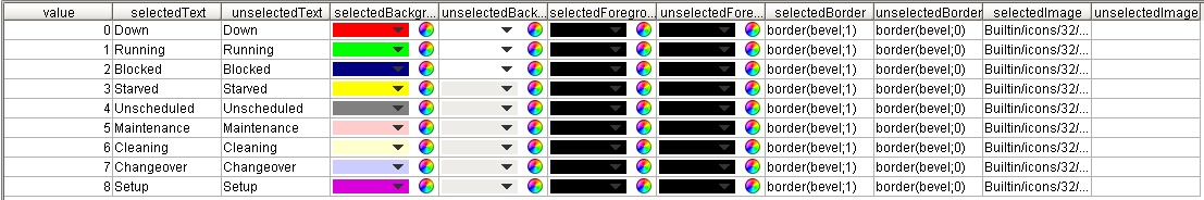 |