XY Chart Example - Bar Chart
This example demonstrates how to configure a bar chart using the XY Chart component.
Configuring a Bar Chart Example
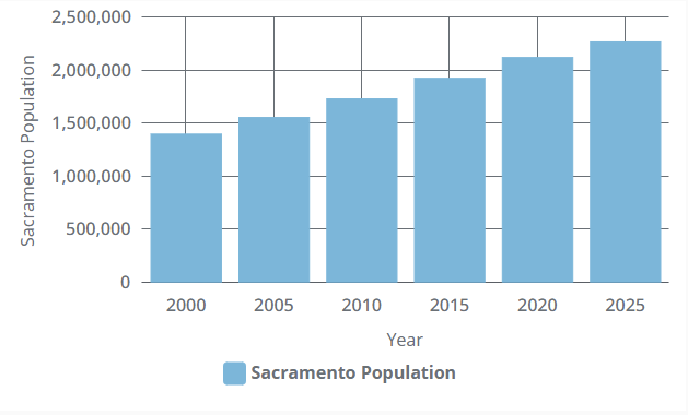
In this example, we'll configure the XY Chart as a bar chart and display population data from the city of Sacramento every five years since 2000. We'll start by changing our chart to use bars instead of lines.
-
Create an XY Chart in the Designer and select it.
-
In the Perspective Property Editor, navigate to the series.0.render property and change the type from line to column.
-
We'll now have our bar chart display our data. Copy the JSON content below, and paste it onto the chart component's dataSources.example property.
[
    {
        "year": "2000",
        "sacramento": 1401000
    },
    {
        "year": "2005",
        "sacramento": 1558000
    },
    {
        "year": "2010",
        "sacramento": 1733000
    },
    {
        "year": "2015",
        "sacramento": 1927000
    },
    {
        "year": "2020",
        "sacramento": 2123000
    },
    {
        "year": "2025",
        "sacramento": 2269000
    }
] -
We will now need to adjust several properties to reflect our JSON content so that our data will render. Update the settings under the xAxes.0 property to the corresponding values listed below:
- name: year
- label.text: Year
- date.baseInterval.enabled: true
- date.baseInterval.timeUnit: year
- date.baseInterval.skipEmptyPeriods: true
- date.inputFormat: yyyy
- date.format: yyyy
-
Update the settings under the yAxes.0 property to the corresponding values listed below:
- name: sacramento
- label.text: Sacramento Population
- value.range.min: 0
-
Update the settings under the series.0 property to the corresponding values listed below:
- name: sacramento
- label.text: Sacramento Population
- data.x: year
- data.y: sacramento
- xAxis: year
- yAxis: sacramento
-
Next, navigate to the series.1 and yAxes.1 properties and delete them. We will not need a second series of data for this example.
-
You may notice that the data rendered is off-center, with bars not aligning with their year values.
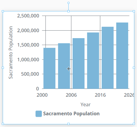
To fix this, use the handles on the XY Chart to widen the component. This will resize the chart so that the data is properly displayed.