Navigating with the Horizontal Menu Component
The Horizontal Menu component enables you to build a menu structure by setting up multiple links to different page URLs from the component. Our example has a menu with links to three internal pages and one external page on the Internet.
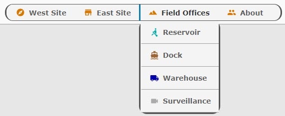
This example shows a Horizontal Menu with four items. Three items are linked to views within the Perspective project and the fourth is linked to a website. The third item in the list, Field Offices, has four subitems.
Initial Project Setup
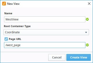
To begin with we have created three views: WestView, EastView, and Welcome. They are each coordinate type views. As we create each new view, we checked the Page URL property and added a page name.
| View Name | Page URL |
|---|---|
| WestView | /west_page |
| EastView | /east_page |
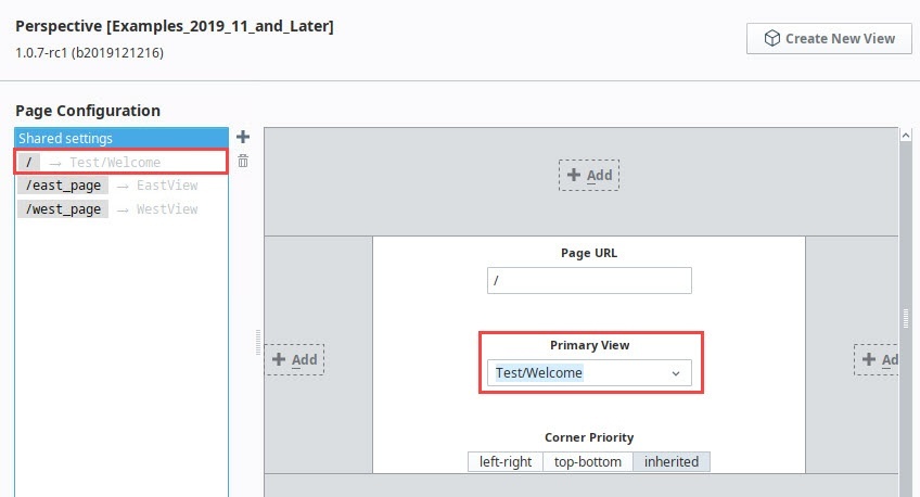
| Welcome | / |
On Page Configuration, you'll note that each page is already set up with a Primary view.
Now we're ready to start building the navigation.
Set Up a Header View
The first thing we'll set up is a view that will hold the Horizontal Menu component. We'll use this view as a header for our pages within this project.
-
In the Project Browser, right click on Views and select the NewFolder
 option. Name the folder "Header".
 -
Right click on the Header folder and select the NewView
 option.
-
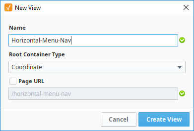
Name: Horizontal-Menu-Nav
-
Layout: Coordinate
-
Page URL: unchecked
-
-
Click Create View.
-
In the Property Editor for the view, set the defaultSize property as follows:
- width: 800
- height: 50
-
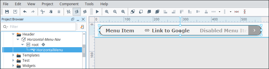
Drag a Horizontal Menu component onto the view.
-
In the Property Editor, set the Position Properties as follows:
Property Value position.x 15 position.y 10 position.width 550 position.height 30 -
In the Property Editor, scroll down to style and click the ModifyStyle
 icon.
icon.-
Expand the Text section and set the style options as follows:
Property Value props.style.fontWeight bolder props.style.fontFamily Verdana props.style.fontSize 14px -
Expand the Border section and set the style options as follows:
Property Value props.style.borderStyle solid props.style.borderColor #555555 props.style.borderRadius 16px All Corners (selected)
Your Designer will look like this at this point:
-
-
Open Page Configuration by clicking on the Settings
 icon at the bottom left of the Designer window.
 -
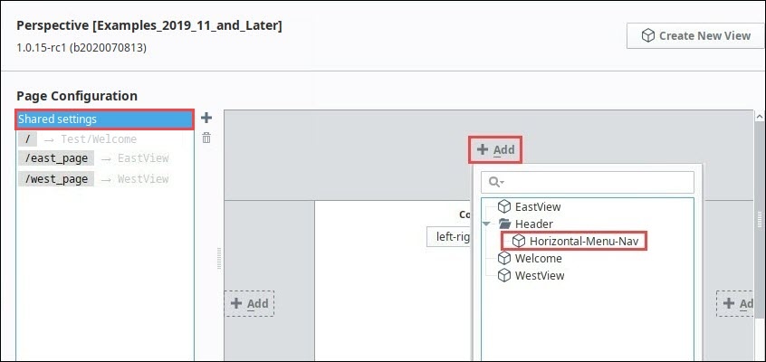
Under Page Configuration, click on Shared Settings.
-
In the header part of the page mockup, click on the Add
 icon.
icon. -
Select the Horizontal-Menu-Nav view from the dropdown.
-
Click OK. The Horizontal-Menu-Nav view will now appear at the top of all pages in the project.
Configure the Tabs in the Horizontal Menu
Now let's set the properties for each of the four tabs in the Horizontal Menu. Each tab will have a display a name and an icon and will have a target page or website to open when clicked.
-
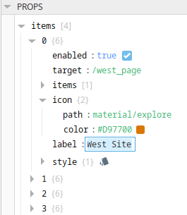
In the Property Editor, expand the items property and set the following for item 0:
Property Value props.items.0.enabled true props.items.0.target /west_page props.items.0.icon.path material/explore props.items.0.icon.color #D97700 props.items.0.label West Site The Property Editor will look like this:
-
In the Property Editor, set the following for item 1:
Property Value props.items.1.enabled true props.items.1.target /east_page props.items.1.icon material/store props.items.1.color #D97700 props.items.1.label East Site -
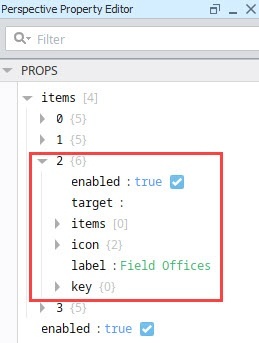
In the Property Editor, set the following for item 2:
noteDo not set a props.items.2.target property value for this tab because we will set up dropdown tabs in the next section.
Property Value props.items.2.enabled true props.items.2.icon.path material/landscape props.items.2.icon.color #D97700 props.items.2.label Field Offices -
In the Property Editor, set the following for item 3:
noteThis tab uses a website as its target, therefore it does not need to target a page within Perspective.
Property Value props.items.3.enabled true props.items.3.target http://inductiveautomation.com/about/ props.items.3.icon.path material/people props.items.3.icon.color #D97700 props.items.3.label About
Configure the Field Offices Tab in the Horizontal Menu
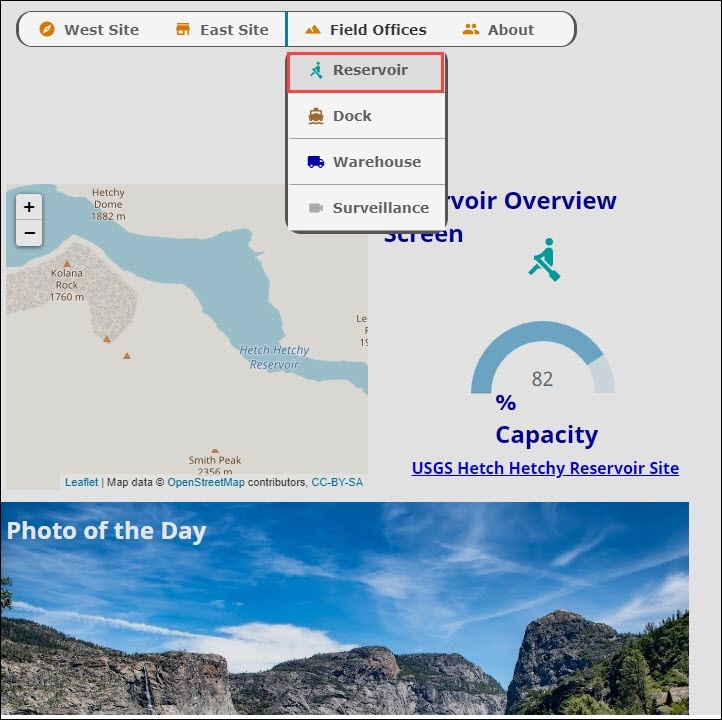
The third tab in the Horizontal Menu is titled "Field Offices." Instead of navigating to one page, this tab has a dropdown menu with four options on it: Reservoir, Dock, Warehouse, and Surveillance.
-
To start, we created a new folder in Views called Field.
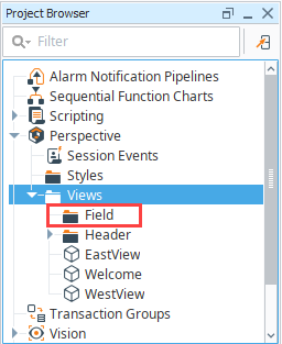
-
Within the Field folder, we create four views: Reservoir, Dock, Warehouse, and Surveillance. Make them Coordinate types and set up a page URL for each.
View Name Page URL Reservoir /reservoir_page Dock /dock_page Warehouse /warehouse_page Surveillance /surveillance_page -
Open the Horizontal-Menu-Nav view and select the Horizontal Menu component.
-
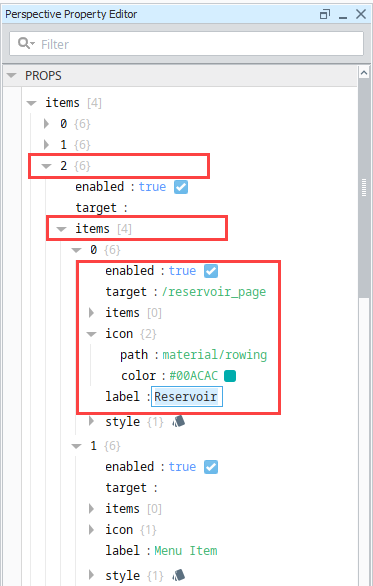
In the Property Editor, expand the properties for Item 2.
-
Select the props.items.2.items property.
-
Click the Add
 icon to add four items.
 -
Set the properties for Item 0 as follows:
Property Value props.items.2.items.0.enabled true props.items.2.items.0.target /reservoir_page props.items.2.items.0.icon.path material/rowing props.items.2.items.0.icon.color #00ACAC props.items.2.items.0.label Reservoir The Property Editor will look like this:
-
Now we'll do the same for the other three items. Set the properties for Item 1 as follows:
Property Value props.items.2.items.1.enabled true props.items.2.items.1.target /dock_page props.items.2.items.1.icon.path material/directions_boat props.items.2.items.1.icon.color #9E6635 props.items.2.items.1.label Dock -
Set the properties for Item 2 as follows:
Property Value props.items.2.items.2.enabled true props.items.2.items.2.target /warehouse_page props.items.2.items.2.icon.path material/local_shipping props.items.2.items.2.icon.color #0000AC props.items.2.items.2.label Warehouse -
Set the properties for item 3 as follows:
Property Value props.items.2.items.3.enabled true props.items.2.items.3.target /surveillance_page props.items.2.items.3.icon.path material/videocam props.items.2.items.3.icon.color #AAAAAA props.items.2.items.3.label Surveillance -
Save your project.
-
Click Tools > Launch Perspective > Launch Session.
-
Click on the tabs in the header to view different pages. For our example, we have put a few components on each view. Here is an example of what the Field Offices > Reservoir page might look like: