Tree View

Component Palette Icon:
Description
The Tree View component can display any tree hierarchy. It is configured by filling in a dataset. Each row in the dataset will become a node in the tree. Each node has a path, for example, "West Area/Process/Valve1" that determines its location in the tree. The Separation Character property (by default it is forward-slash), dictates how the paths are broken up. Any missing folder nodes needed by a leaf node are created implicitly.
The other columns in the dataset besides "Path" are used to configure the look for the node, both when it is selected and when it is not. This component recognizes the following column titles. The references to optional column titles means that a dataset does not need to have them present in the dataset for the tree to render and function.
- Path - the path determines the node's location. Broken up into a list by splitting on the separation character.
- Text - the text of the node while not selected.
- Icon - a path to an icon for the node. Use the value: "default" to use the tree automatic folder/leaf icons. [optional]
- Background - a string column that will be coerced into a color for the unselected background. e.g. "white" or "(255,255,255)" Use an empty string to use the default color.[optional]
- Foreground - a string representation of the unselected foreground color. [optional]
- Tooltip - if not empty, will be used as the tooltip for the node.[optional]
- Border - a string that will be coerced into a Border for the node while unselected. May be empty.[optional]
- SelectedText - the text of the node while selected.[optional]
- SelectedIcon - a path to an icon for the node while selected. Use the value: "default" to use the tree automatic folder/leaf icons.[optional]
- SelectedBackground - a string representation of the selected foreground color.[optional]
- SelectedForeground - a string representation of the selected foreground color.[optional]
- SelectedTooltip - if not empty, will be used as the tooltip for the node while selected.[optional]
- SelectedBorder - a string that will be coerced into a Border for the node while selected. May be empty.[optional]
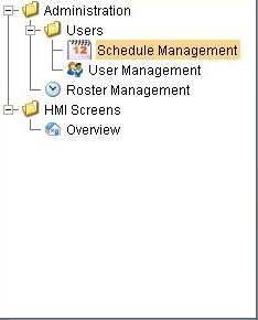
Below is an example configuration of the treeview's items property. Notice how not all of the fields listed above are used, because there are certain properties that are not necessary to build our treeview. Notice how I have chosen a larger version of the same images for the Selected Icon, so that when an item gets selected, not only does the background color change, but the size of the image changes as well.
| Path | Text | Icon | Background | Foreground | SelectedText | SelectedIcon | SelectedBackground | SelectedForeground |
|---|---|---|---|---|---|---|---|---|
| HMI Screens | Overview | Builtin/icons/16/home.png | color(255, 255, 255, 255) | color(0, 0, 0, 255) | Overview | Builtin/icons/24/home.png | color(250, 214, 138, 255) | color(0,0,0,255) |
| Administration/Users | User Management | Builtin/icons/16/users3.png | color(255, 255, 255, 255) | color(0, 0, 0, 255) | User Management | Builtin/icons/24/users3.png | color(250, 214, 138, 255) | color(0,0,0,255) |
| Administration/Users | Schedule Management | Builtin/icons/16/calendar.png | color(255, 255, 255, 255) | color(0, 0, 0, 255) | Schedule Management | Builtin/icons/24/calendar.png | color(250, 214, 138, 255) | color(0,0,0,255) |
| Administration | Roster Management | Builtin/icons/16/clock.png | color(255, 255, 255, 255) | color(0, 0, 0, 255) | Roster Management | Builtin/icons/24/clock.png | color(250, 214, 138, 255) | color(0,0,0,255) |
Properties
| Name | Description | Property Type | Scripting | Category |
|---|---|---|---|---|
| Antialias | Draw with antialias on? Makes text smoother. | boolean | .antialias | Appearance |
| Auto Expand | If true, the tree will automatically expand the tree structure up to the level specified by Auto Expansion Level. | boolean | .autoExpand | Behavior |
| Auto Expansion Level | If Auto Expand is true, this is the depth level that will be expanded. Zero means expand-all. | int | .autoExpansionLevel | Behavior |
| Auto Sort | Whether or not to automatically sort the tree. | boolean | .autoSort | Behavior |
| Background Color | The background color of the component. | Color | .background | Appearance |
| Border | The border surrounding this component. NOTE that the border is unaffected by rotation. | Border | .border | Common |
| Data Quality | The data quality code for any tag bindings on this component. | int | .dataQuality | Data |
| Default Closed Icon | The default closed icon if no icon is set. | String | .defaultClosedIconPath | Appearance |
| Default Leaf Icon | The default leaf icon if no icon is set. | String | .defaultLeafIconPath | Appearance |
| Default Node Background | The default background of a node if no background is set. | Color | .defaultBackground | Appearance |
| Default Node Border | The default border of a node if no border is set. | Border | .defaultBorder | Appearance |
| Default Node Foreground | The default foreground of a node if no foreground is set. | Color | .defaultForeground | Appearance |
| Default Node Selected Background | The default selected background of a node if no background is set. | Color | .defaultSelectedBackground | Appearance |
| Default Node Selected Border | The default selected border of a node if no border is set. | Border | .defaultSelectedBorder | Appearance |
| Default Node Selected Foreground | The default selected foreground of a node if no foreground is set. | Color | .defaultSelectedForeground | Appearance |
| Default Open Icon | The default open icon if no icon is set. | String | .defaultOpenIconPath | Appearance |
| Enabled | If disabled, a component cannot be used. | boolean | .componentEnabled | Common |
| Font | Font of text on this component. | Font | .font | Appearance |
| Items | Contains the items of the tree view. | Dataset | .data | Data |
| Line Style | The tree's line style. | int | .lineStyle | Appearance |
| Mouseover Text | The text that is displayed in the tooltip which pops up on mouseover of this component. | String | .toolTipText | Common |
| Name | The name of this component. | String | .name | Common |
| Row Height | The height of each row in the tree. | int | .rowHeight | Appearance |
| Selected Item | The index of the currently selected item, or -1 if no selection. | int | .selectedItem | Data |
| Selected Path | The path of the currently selected item, or "" if no selection. | String | .selectedPath | Data |
| Selection Mode | What kind of selection regions does the tree allow. | int | .selectionMode | Behavior |
| Separation Character | The separation character for the path. | String | .separationCharacter | Behavior |
| Show Root Handles | Whether or not to show handles next to parent nodes. | boolean | .showRootHandles | Appearance |
| Visible | If disabled, the component will be hidden. | boolean | .visible | Common |
Scripting
See the Tree View Scripting Functions page for the full list of scripting functions available for this component.
Event Handlers
Event handlers allow you to run a script based off specific triggers. See the full list of available event handlers on the Component Events page.
Customizers
The tree view customizer allows for easy custom manipulation of the tree view components underlying formatting.
Examples
//The Selected Item property will be updated as the user selects different nodes in the tree.
//It represents the index in the Items dataset at which the node is defined. If the selected
//node was implicitly created, the Selected Item will be -1.
//You can use this index to get the path and name of the selected node with an expression binding like this:
if ({Root Container.Tree View.selectedItem}<0,"n/a",{Root Container.Tree View.data}[{Root Container.Tree View.selectedItem},"text"])
#This script will swap to the script that was double clicked on, if this code is placed in the mouseClicked event handler for the treeview
#This script utilizes an extra column called windowPath that contains the full path to the window. You can add an extra column to the Items dataset property
#as long as the column name doesn't match one of the reserved column titles listed above.
if event.clickCount == 2:
    row = event.source.selectedItem
    data = event.source.data
    if row != -1:
        # Grab the window path value out of the tree view's items dataset
        windowPath = data.getValueAt(row, "windowPath")
        system.nav.swapTo(windowPath)