Perspective - XY Chart Properties
 Deprecated by the radius property in 8.3.5.
The width and height properties included under the bullets configuration were removed and replaced with a radius property for consistency with how circle configuration is handled. Note that only the affected property tables for the removed properties have been included on this page.
Click here to learn more about the radius property.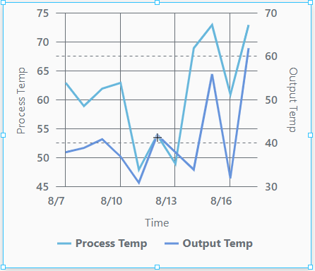
Component Palette Icon
The XY Chart displays data trends. It provides a flexible way to display either timeseries or X-Y data by entering data in the dataSources property. It is fully customizable in its appearance, from labels, colors, line widths, legend, scroll bars, and text styles.
Properties
Most Properties have binding options. This section only documents the Props Category of properties.
| Name | Description | Property Type |
|---|---|---|
| dataSources | Objects that are the data source for the chart. When configured to show a date or time on the x-axis, the chart expects that each entry in a data source is already sorted in ascending timestamp order. It is highly advised that you sort the contents of any given data source. | array |
| title | Chart title configuration. | value:string |
| subtitle | Chart subtitle configuration. | object |
| legend | Settings for the chart legend. | object |
| cursor | Settings for the chart cursor. | object |
| enableTransitions | Whether the transition animations are enabled for this chart. Default is false (disabled). | boolean |
| scrollBars | Configuration for the scroll bars on the chart. | object |
| selection | An object that contains selection related properties. Data points in a series can only be selected if series.#.render is set to either column, candlestick, or line with bullets enabled. | object |
| background | Configuration for the background of the chart. | object |
| xAxes | Configuration properties for the X Axes of the chart. | array |
| yAxes | Configuration properties for the Y Axes of the chart. | array |
| series | An array of series configurations to apply to this chart. | array |
| style | Sets a style for this chart. Full menu of style options is available for text, background, margin and padding, border, shape and miscellaneous. You can also specify a style class. | object |
series Properties
series
| Name | Description | Property Type |
|---|---|---|
| name | A unique name to identify this application of this series. | value: string |
| label | Series label to use with legend. | object |
| visible | Enables series visibility. Default is true. | value: boolean |
| hiddenInLegend | Hides the series in the legend. Default is false. | value: boolean |
| defaultState | Series default state configuration. Default is true (visible). | value: boolean |
| data | Data settings for the series. | object |
| xAxis | Name of the x axis configuration object to be used with this series. | value: string |
| yAxis | Name of the y axis configuration object to be used with this series. | value: string |
| zIndex | Sets the series stack order relative to other series. | value: numeric |
| tooltip | Tool tip configuration for the series. | object |
| render | The series render mode. Options are candlestick, column, line, stepLine. Default is line. | value: string dropdown |
| candlestick | When render is set to candlestick, the following candlestick settings are available. See the XY Chart Example - Candlestick Chart page for more information on how to configure a candlestick chart. | object |
| column | When render is set to column, column settings are available. | object |
| line | When render is set to line, line settings are available. | object |
| stepLine | When render is set to stepLine. StepLine settings are available. | object |
series.line
| Name | Description | Property Type |
|---|---|---|
| open | Configures the open data. | object |
| appearance | Configures the appearance of the line series. | object |
series.line.appearance
| Name | Description | Property Type |
|---|---|---|
| connect | Connects the lines over empty data points. Default is true. | value: boolean |
| tensionX | Horizontal tension setting of the line. Range is 0 to 1. A 1 value indicates high tension, so the line is maximally attracted to the points it connects (i.e. straight line). A 0 value means the opposite. Default is 1. | value: numeric |
| tensionY | Vertical tension setting of the line. Range is 0 to 1. A 1 value indicates high tension, so the line is maximally attracted to the points it connects (i.e. straight line). A 0 value means the opposite. Default is 1. | value: numeric |
| minDistance | The minimum distance (in pixels) between two points. Default is 0.5. | value: numeric |
| stroke | Series stroke configuration. | object |
| fill | Series color configuration. | object |
| bullets | Series bullet configuration. | array |
series.line.appearance.bullets
| Name | Description | Property Type |
|---|---|---|
| enabled | Enables bullets. | value: boolean |
| render | Type of bullet to render. Options are circle or label. | value: string dropdown |
| width | Bullet width. | value: numeric |
| height | Bullet height. | value: numeric |
| label | Label properties. | object |
| tooltip | Tooltip configuration. | object |
| fill | Fill settings. | object |
| stroke | Stroke settings. | object |
| rotation | Rotation of the bullet. | value: numeric |
| deriveFieldsFromData | Settings for derived fields. | object |
| heatRules | These heat rules apply to the radius of a circular bullet. | object |