Perspective - Tag Browse Tree
Component Palette Icon:

Description
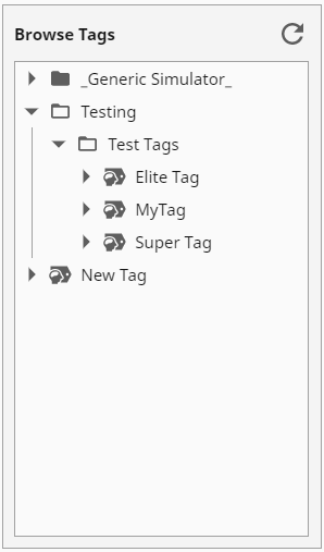
The Tag Browse Tree component displays a tree hierarchy based on an array of objects. Icons can be chosen for the nodes of the tree, and different icons can be used when an node is expanded or collapsed.
Properties
Most Properties have binding options. For more information on Bindings, see Types of Bindings in Perspective. This section only documents the Props Category of properties. The other Categories are described on the Perspective Component Properties page.
| Name | Description | Property Type |
|---|---|---|
| root | Configuration for the path from which the displaying folder/tag structure will start.
| object |
| filter | Tree filtering configuration.
| object |
| selection | Configuration for the selected tag.
| object |
| display | Display settings for the component.
| object |
| style | Sets a style for this component. Full menu of style options is available for text, background, margin and padding, border, shape and miscellaneous. You can also specify a style class. | object |
Component Scripts and Events
Further component interaction and functionality can be configured for all components through scripting and event actions. Right-click on the component or select Components from the Designer menubar to access the configuration popups for both of these options:
- Configure Events: Accesses the Event Configuration popup where you can configure actions to run in response to events to make the component dynamic. The Events Configurations page shows how to configure events and actions on a Perspective component.
- Configure Scripts: Accesses the Script Configuration popup where custom methods and message handlers can be added. The Scripting in Perspective section details scripting fundamentals, creating custom methods, and using message handlers.
The Tag Browse Tree component also has Component Events and Extension Functions associated with it. See the Perspective - Tag Browse Tree Scripting page for more information.
Example
| Property | Value |
|---|---|
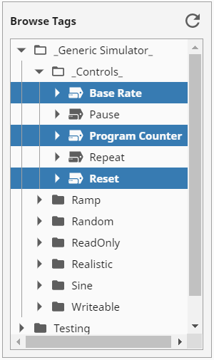
| selection.mode | multiple |
| selection.values.0 | _Generic Simulator_/_Controls_/Base Rate |
| selection.values.1 | _Generic Simulator_/_Controls_/Program Counter |
| selection.values.2 | _Generic Simulator_/_Controls_/Reset |